Separators
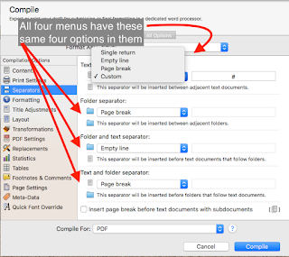
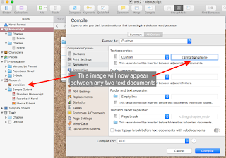
break, or a custom separator you type in the space next to the selection. You can get creative here if you want to since the “custom” type permits a line of text to be included. This includes the Image Placeholder tags. The image placeholder tag is <$img:>, with a required element after the colon that identifies the image to use. If you have already imported the image into the binder (which I recommend, just for simplicity’s sake), you can simply use the name that shows up in the binder. As an example, let’s say you have an image file called “transition”, which you have placed in your binder. To use that file in your “custom” file->file Separator type, select “Custom” for the Text separator and type <$img:transition> into the text field next to the popup menu. This image will now appear with a blank line above and another below
wherever two text documents appear in your binder, visually separating them.
Layout
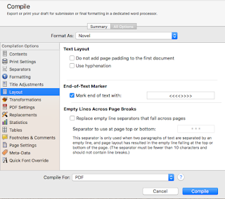
Options available to the Options pane change somewhat depending on what kind of output type for which you are compiling. There is one option always present and one present to all output types except iBook Author, the “Do not add page padding to first document” (all) and “End of text marker” (all except iBooks). With the first option checked (“Do not add…”), the compiler will not insert padding on the top of the first page of the document if that document would otherwise have padding. This is an option available from the Formatting pane, “Page Padding.” If there is padding set on the Formatting page, any time a new page is created it will have the specified number of blank lines inserted at the top before the Title, Title Prefix, Title Suffix, or page text. For example, if your settings create a page break for every new chapter (folder) and “page padding” is set to 14 on the Formatting pane, the first page of every new chapter will have fourteen blank lines inserted before the Chapter Title. To avoid this from happening to the very first document of the compiled output, check this box here. This might happen if, for example, you print out only the manuscript, with no title or front matter, and don’t want that first page to start 14 lines down.
The “End of text marker” option allows you to specify a text string that will be placed at the very end of the document by the compiler, signaling the end of the manuscript’s text. This allows you to specify this text—which is sometimes required for submission or printing—without actually having it appear anywhere in the editor while you are working on your document (so you can’t accidentally delete it).
When you are compiling for PDF or Print output one more option appears here, “Empty Lines Across Page Breaks.” With this setting enabled, any empty line Separator (from the Separators pane) that would be the last element on a page before a page break or the first element after it will be replaced instead with the text you type in the field. This ensures that all scene transitions are visible in the output document.
Additionally, RTF (but not .rtfd), Word, and OpenOffice output types have three more options appear here. If enabled, “Use hyphenation” will hyphenate words that would normally be kept intact across line breaks; by default, this is not enabled. “Avoid widows and orphans” attempts to adjust paragraph padding only for paragraphs that will leave the last line on the following page (a ‘widow’) or will have all but the first line on the following page (an ‘orphan’). “Columns” will output the compiled document using the column settings specified (it does not create columns in the project itself, only the output).
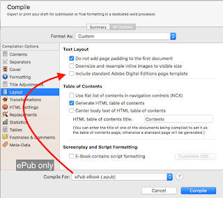
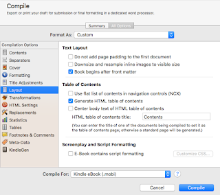 Finally, if you select .epub or .mobi output types, there are several additional options that appear to help control the layout and appearance of these documents. Selecting “Downsize and resize inline images to visible size” will change the sizing on any inline images for your document to the actual visible size of the image in the document, for the compile output only, in order to reduce the size of the compiled file. For ePub, “Include standard Adobe Digital Editions page template” will generate an ADE file which may be required for certain devices to properly display the document. If your output is aimed at these documents (the Kobo, Sony reader, Nook, and others), select this option to make sure the ADE file is created. In the .mobi output type, this option changes to “Book begins after front matter” instead; selecting it with Front Matter enabled on the Contents Option pane will mark the first page of the actual manuscript as the start of the book, bypassing the any of the front matter when the reader opens the file initially.
With these two eBook formats, a Table of Contents section appears, allowing you to specify what table of contents will get created with your compiled output, if any, and if you have one already created you can put the name of that document in the field for “HTML table of contents file” and it will be used instead. Note that Amazon will not accept a .mobi file without an HTML table of contents. The setting for “Use flat list of contents in navigation controls” will generate the table of contents without regard to how deep the items appear in the document structure—say, if you use Parts with Chapters, each of which contain multiple Scenes, it will not differentiate those items based on their status as a level 1 (Part) or level 2 (chapter), but only their location in the overall structure. “Generate HTML table of contents” will create an actual document in the compiled output, in addition to the automatically created—but not user-visible—software table always created by the Scrivener compiler. Enabling “Center body text in HTML table of contents” creates a table of contents centered in the page, rather than aligned to the left side.
Tables
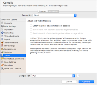
The final of these Option panes is the Tables Options. This pane is generally used if the compiled output needs to be formatted as a single table, for the entire output document. In general, it is a rarely used Option pane, but when you need it, you need it. Two of the options only become available if the first is ticked (“Stitch together adjacent tables if possible”); ticking this box will tell the compiler to do its best to combine all tables in the entire document that are separated only by spaces and blank lines. The other two options, “Insert blank row between stitched-together tables” and “Restrict width of stitched-together tables to page width” are reasonably straight forward, and do exactly as advertised. There is one additional option for .mobi output only, where you can tell the compiler to turn tables into images instead of text tables, and specify the maximum width of the resulting images.
In conclusion
So far, we’ve covered quite a large section of the compiling options available, but there are quite a few more yet to go. Hopefully, I’ve been able to inform your use of the Separators, Layout, and Tables Options when Compiling in Scrivener, making it easier and more reliable for you to take advantage of these features. The next blog post in this series will cover the Footnotes and Quick Font Override Options, as well as Page Settings. As always, leave any questions or comments below, and I hope to see you in a couple of days!
Next in this series -> Footnotes, Quick Font Overrides, and Page Settings

No comments:
Post a Comment
Note: Only a member of this blog may post a comment.